
How to Choose Jersey Names and Number Fonts That Stay Readable
Choose readable jersey name and number fonts with the right rules, contrast, spacing, character set, licensing, roster proof and print-size test.
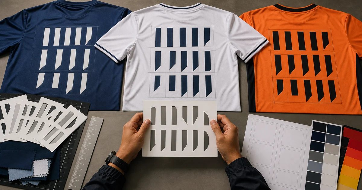
The short answer: check the event or league rulebook first. Then choose a bold, open font with clearly different characters, strong contrast and a complete character set. Approve every name and number at real print size on the actual jersey before production.
There is no universal “football font” or fixed number size that works for every school, corporate league, futsal event, esports team or governing body. FIFA’s 2026 kit review is a useful current example: reviewers check the regulation of names and numbers, font readability, colour contrast and physical kit samples. Your organiser may use different requirements.
Jersey font approval checklist
| Check | What to confirm before production |
|---|---|
| Competition rules | Required content, position, size range, colour and approved style |
| Number legibility | 0/O, 1/I, 5/S and curved numerals do not look interchangeable |
| Name fit | Longest approved name fits without extreme squeezing or distortion |
| Character support | Capitals, lowercase if used, hyphens, apostrophes and required diacritics exist |
| Contrast | Light-on-dark or dark-on-light remains clear over the jersey pattern |
| Final dimensions | Full-size paper proof and physical sample are readable from the intended distance |
| Print method | Thin gaps and outlines are suitable for sublimation, DTF, screen print or vinyl |
| Licence | Commercial use is allowed and the source licence is recorded |
| Roster data | Display name, number and size are approved from one locked master sheet |
Read the rulebook before opening the font menu
For an official competition, request the current season’s kit or equipment rules from the organiser. Confirm:
- whether both a player name and number are required;
- permitted positions and colour combinations;
- minimum or maximum dimensions, if specified;
- whether a competition mark must appear;
- whether one font must be used across the whole team; and
- whether the organiser needs a kit sample before match day.
Do not copy FIFA measurements or a professional club style into a local event unless the organiser adopts those rules. FIFA’s current World Cup process also considers dark-versus-light contrast and accessibility, but a Malaysian school or corporate tournament can issue its own standard.
Choose number shapes that cannot be confused
The best-looking display font can fail when several characters share the same skeleton. Create a test row that includes the full numeral set and the name characters your roster actually uses.
Pay special attention to:
- zero compared with a capital O;
- one compared with a capital I or lowercase l;
- five compared with S;
- six, eight and nine at a distance;
- narrow internal spaces that may close during printing; and
- decorative cuts that disappear on textured fabric.
Judge the shapes from several metres away, not only at 400% zoom. A condensed font can save width, but an extremely narrow character can lose clarity. Open counters and simple silhouettes usually survive motion, folds and uneven lighting better.
Set a name-fit rule before collecting the roster
Find the longest expected display name and test it first. Avoid stretching a font horizontally or shrinking one player’s name until it looks unrelated to the rest of the team.
Agree on a consistent policy, such as:
- one approved typeface and capitalisation style;
- a defined safe width between the shoulder seams;
- a minimum readable size based on the physical proof;
- approved abbreviations for names that exceed the safe width; and
- treatment of spaces, hyphens, apostrophes and diacritics.
Ask each player to approve the display name, not just their legal name. This catches preferred spellings before film, panels or transfers are produced.
Build contrast around the final jersey artwork
A dark number on a dark pattern is difficult to read even when the typeface is excellent. Test the name and number over the busiest area of the actual back design.
Start with a strong value difference: light artwork on a dark jersey or dark artwork on a light jersey. An outline can separate a mark from a patterned background, but too many outlines create visual noise and small gaps may fail at production size. For colour-sensitive artwork, use the Pantone, CMYK and RGB guide to communicate references while remembering that physical output still needs a sample.
Print the proof in greyscale as a quick contrast check. If the name and number merge with the background without colour, increase separation or simplify the area behind them.
Test real size on the smallest and largest jersey
A monitor mockup cannot prove physical dimensions. Print the name and number on paper at 100%, trim the outline and place it on the jersey back. Check it while the jersey is flat and worn.
Verify:
- clearance from collar, seams, ventilation panels and sponsor marks;
- proportional balance on the smallest and largest garment sizes;
- readability at the distance relevant to the activity;
- whether folds or a tucked hem hide important parts; and
- whether the print method keeps thin gaps and outlines open.
Do not scale every size automatically without an approved rule. One print dimension may overwhelm a very small youth jersey, while proportionally shrinking it may violate competition requirements. The logo print-size guide provides the same full-size proof principle for other jersey marks.
Confirm the font has every required character
Before approval, type the complete roster—not a placeholder such as PLAYER NAME. Check accented letters, apostrophes, hyphens and any language-specific characters the team needs. A font may contain attractive English capitals but lack a required glyph or use a visibly different fallback.
Also check the numeral style in the exact font weight. Some families change the shape of 1, 4 or 7 between weights, and some use old-style numerals that sit at different heights. Keep the font file, weight and version with the final artwork package.
Use a font you are licensed to print
“Free download” does not automatically mean free for a commercial jersey order. Record the font name, source, version and licence when the artwork is approved.
Google Fonts provides open-source fonts for commercial and non-commercial use. Many are released under the SIL Open Font License, which permits use in artwork subject to its conditions. This is a safer starting point than an unknown download, but it does not grant permission to copy a club’s protected crest, wordmark or complete kit identity.
When converting text to outlines for production, also supply an editable proof or roster. Outlined artwork prevents font substitution, while the editable record helps correct an approved spelling without rebuilding the design blindly. See the AI, PDF, PNG and SVG artwork guide for file handover.
Lock player data with a proof sheet
Use one master roster with a unique row per garment. Useful columns are:
- player or garment ID;
- exact display name;
- jersey number;
- garment size;
- colour or team, if the order has variants; and
- approval status.
Generate a proof sheet from that data and ask one authorised person to approve it. Test the longest name and easily confused combinations first. Keep the approved file with the job number so a replacement jersey can match the same spelling, font, size and position.
Do not send corrections across several chat messages. Return one revised master sheet with changes clearly marked, then lock the version and approval date.
Give the printer an approval-ready brief
Send the rulebook, final artwork, licensed font information, roster, size breakdown, jersey mockup, physical dimensions, colour reference, deadline and sample requirement. State whether the names and numbers will be sublimated into custom panels or applied to ready-made jerseys; the sublimation vs DTF jersey guide explains the workflow difference.
You can compare Malaysian jersey printers with one brief or browse suppliers by state. Ask for a final-size sample and roster proof before authorising the complete run.
Frequently asked questions
What is the best font for jersey names and numbers?
There is no single best font. Start with the competition rulebook, then choose a bold, open and readable family whose numbers remain distinct at the final size. Test easily confused characters, long names and contrast on the actual jersey.
How big should jersey names and numbers be?
There is no universal size for every sport or event. Use the organiser's current rules where applicable, then make a full-size paper proof and physical garment sample. Check the smallest and largest jersey sizes rather than scaling from one mockup blindly.
Should jersey numbers have an outline?
An outline can improve separation when the jersey background is busy or close in value to the number, but it must remain clean at final print size. Strong single-colour contrast may be clearer than an unnecessary multi-outline effect.
Can I use any downloaded font for commercial jerseys?
No. Check the font's licence and keep a copy of the licence record. Open-source libraries such as Google Fonts are a convenient starting point, but you must still follow the relevant licence terms and avoid copying protected team identities.
Ready to compare suitable printers?
Get 5 Free Quotes